
Sunday, 24 December 2006
Thursday, 21 December 2006
Oceanographer's Choice
The moral of the story is to never rely on anything with a microchip in it for anything. In short my computer is trying to kill me and its not going to stop in-till one of us ends up in several bits in a garbage bag at the dump.
Anywho, let this weeks journey begin..
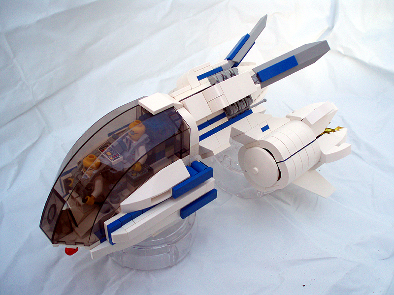
First off the bat we have ATDudley's Panther Hovertank Which looks rather nice.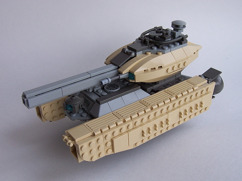
Its got some nifty detailing going on such as the grills in the intakes and the rows of jets on the underside. The separate sections and hatches for gunner and driver are also a nice touch. Bonus points for interior detail. The back of it looks a little bare and vulnerable though, and maybe some more tiles or grills on the sides would help smooth it out a bit.
I've been watching the progress of this WIP at the moment, what can be best described as a big cyclops space ring ship thingy, or simply as the
We also have a Salvage Craft from Spook Its design is simple and yet complex at the same time if that makes any sense. Gotta love the cutting laser and the little headlamp looking things. Even though its an industrial craft I think it could do with a bit of brightening up, perhaps a thin orange racing stripe down the middle or some smaller red highlights?
Now I've decided to experiment with something different this time. Instead of another recent Moc, I'm going to drag out a 'classic' Moc out to comment on.
So here we have Dan Jassim's A-Wing carrier. The absolutely fabulous predecessor and grandaddy of both the Dragonstar and Explorer. I remember seeing this back in 02 and being in absolute awe of the sheer size of the thing. You've gotta love the detail on this thing, like the launch bay, sensor array and the control tower. And its even got an interior whcih is totally cool.
Defiantly something to look back on for sure.
Anywho, let this weeks journey begin..
First off the bat we have ATDudley's Panther Hovertank Which looks rather nice.
Its got some nifty detailing going on such as the grills in the intakes and the rows of jets on the underside. The separate sections and hatches for gunner and driver are also a nice touch. Bonus points for interior detail. The back of it looks a little bare and vulnerable though, and maybe some more tiles or grills on the sides would help smooth it out a bit.
I've been watching the progress of this WIP at the moment, what can be best described as a big cyclops space ring ship thingy, or simply as the
We also have a Salvage Craft from Spook Its design is simple and yet complex at the same time if that makes any sense. Gotta love the cutting laser and the little headlamp looking things. Even though its an industrial craft I think it could do with a bit of brightening up, perhaps a thin orange racing stripe down the middle or some smaller red highlights?
Now I've decided to experiment with something different this time. Instead of another recent Moc, I'm going to drag out a 'classic' Moc out to comment on.
So here we have Dan Jassim's A-Wing carrier. The absolutely fabulous predecessor and grandaddy of both the Dragonstar and Explorer. I remember seeing this back in 02 and being in absolute awe of the sheer size of the thing. You've gotta love the detail on this thing, like the launch bay, sensor array and the control tower. And its even got an interior whcih is totally cool.
Defiantly something to look back on for sure.
Tuesday, 19 December 2006
The Arcade's On Fire!
If you live under a rock and haven't already, check out The Arcade Fire's new song Intervention, if you look hard enough you can find an mp3 lying around. It's got that same old Arcade Fire sound while giving a hint of where things could go. All hail the Canadian music scene.
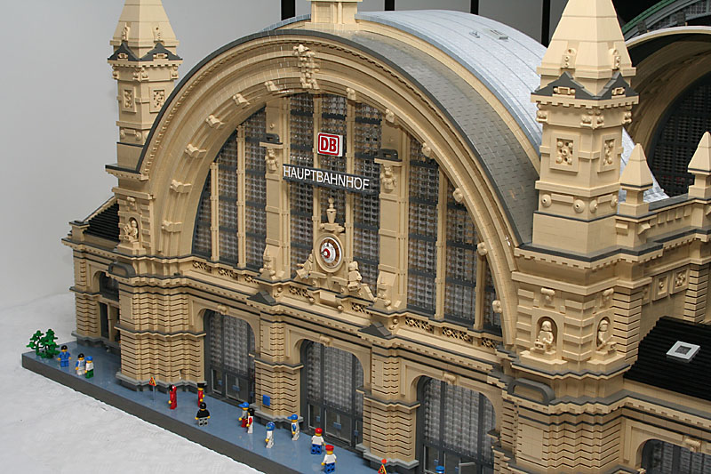 Today's feature isn't microscale, as one might expect from me, or even space for that matter. Today's feature has some of the best building I've seen however, so take a good look. It's the Frankfurt Train Station, I've never been to Germany, thus I have never seen the thing in real life - so whether or not this is an accurate interpretation I don't care. What I do care about, it the amazing amount of detail this thing has, and the amazing techniques it uses! The curved arch is a wonderful example of simple techniques put to amazing uses, and the effect is a smooth - yet still textured - curved roof. This model achieves something I always love, it doesn't immediately appear as LEGO. That I think, makes the penultimate MOC: the ability to take a very recognizable medium and use it to such profound reaches. So take a good look at this one, it's inspirational.
Today's feature isn't microscale, as one might expect from me, or even space for that matter. Today's feature has some of the best building I've seen however, so take a good look. It's the Frankfurt Train Station, I've never been to Germany, thus I have never seen the thing in real life - so whether or not this is an accurate interpretation I don't care. What I do care about, it the amazing amount of detail this thing has, and the amazing techniques it uses! The curved arch is a wonderful example of simple techniques put to amazing uses, and the effect is a smooth - yet still textured - curved roof. This model achieves something I always love, it doesn't immediately appear as LEGO. That I think, makes the penultimate MOC: the ability to take a very recognizable medium and use it to such profound reaches. So take a good look at this one, it's inspirational.
Wednesday, 13 December 2006
Know Your Onion
Today we have a special feature: Some (most, I hope) of you should be familiar with Mike Yoder's work, and would know that he had a bit of a fall from the community a short while back because of personal issues. It was a grave wound to the building community, and me personally. But luck have it, he's back.
We're in the gods favour today, as he comes forth from [seemingly] nowhere with a model bearing that good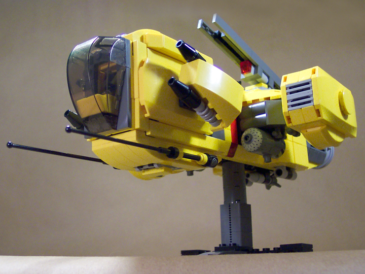 'ol yellow colour scheme that's some familiar with him since that move. For added flavour though, there is a red stripe (yipee!). The Code Enforcer carries a similar construction theme to most of Yoder's recent works, but there's a good deal of improvement among the finer details - and the photography is crystal clear this time, it seems to have escaped the usual compression blender. I'm liking the railgun on this thing, he says it's his first attempt at one and it turned out pretty damn well - they may be basic, but that just leaves less room for error. I'm particularly liking that this model doesn't seem to have any barren spots, that is noting that looks like it was given second treatment or looks unfinished.
An awesome return from an awesome builder. I'm really liking those rotating front guns. Its sad to see someone go, but all the better to see them come back, so: welcome back Mike.
We're in the gods favour today, as he comes forth from [seemingly] nowhere with a model bearing that good
'ol yellow colour scheme that's some familiar with him since that move. For added flavour though, there is a red stripe (yipee!). The Code Enforcer carries a similar construction theme to most of Yoder's recent works, but there's a good deal of improvement among the finer details - and the photography is crystal clear this time, it seems to have escaped the usual compression blender. I'm liking the railgun on this thing, he says it's his first attempt at one and it turned out pretty damn well - they may be basic, but that just leaves less room for error. I'm particularly liking that this model doesn't seem to have any barren spots, that is noting that looks like it was given second treatment or looks unfinished.An awesome return from an awesome builder. I'm really liking those rotating front guns. Its sad to see someone go, but all the better to see them come back, so: welcome back Mike.
Saturday, 2 December 2006
In the Aeroplane Over the Sea
First snow today, mostly gone now but the fact remains where the snow doesn't. Its been a gloomy week, and I think my mood really depends on the weather and this week was pretty cruddy weather-wise; maybe this first snow could signal a change. Some thing to look out for: Nick's new team blog Review'd with Chuck, Jordan, and Andrew.
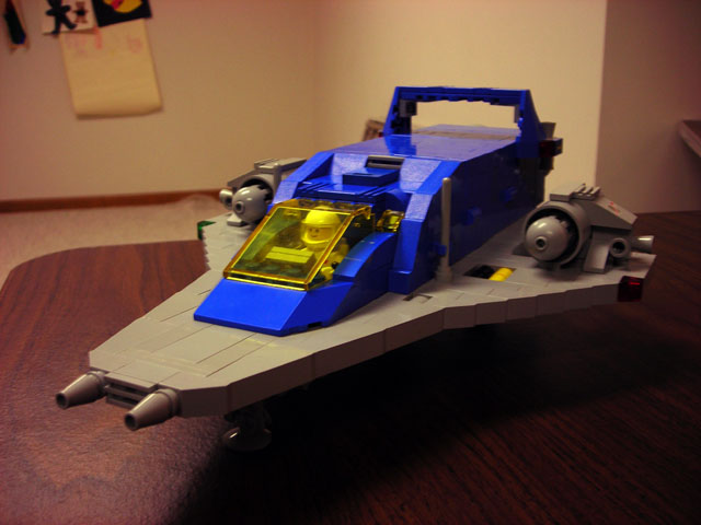
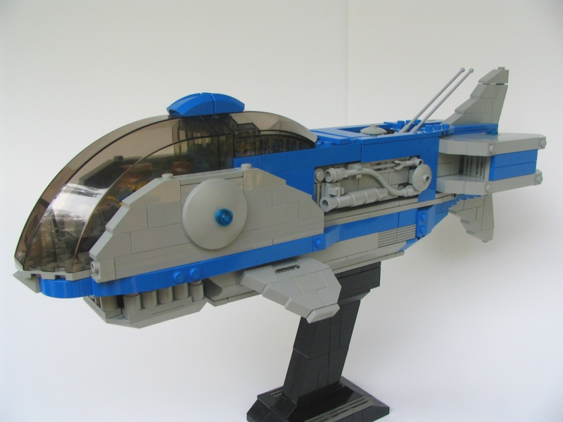
Some may recall my fondness for creations flown under the Neo-Classic Space flag. If not, then now you know. Why bring it up? A quick scan of brickshelf today revealed a gallery by Molly Friedrich which held an interesting model. The other two builders I've featured with this style (seen here: [link]) still had a very conservative restyling of the classic-space theme.
Molly on the other hand, produces a Neo-CS model that looks rather dashing. The other examples retained that very blocky look of the old CS models while updating curb appeal or building techniques, Molly's seems to attack both with a high degree of change. When I first saw the brickshelf I though this was someone's interpretation of an Arwing from Star Fox, colour scheme seemed right. Now the building styles of an Arwing and any CS spaceship are quite different, thus my surprise when I discovered the truth. I'll cut to the point: this thing looks profoundly more deadly than other CS or Neo-CS models, and I like it. It helps too that this thing is built in two 'modules'. I look forward to more, and hope this gives some effect on future Neo-Classic Space models.
Another interesting thing to bring up today is the discussion on Classic-Space.com about the proper grammatical usage of the term LEGO. Is it a Noun, or an Adjective? And does The LEGO Group dictate to the public how to use this term?
My take on it, and you can stop reading now if you don't care: Whenever I've used the word Lego, it's always been in direct reference to the Company or it's product. And thus, perhaps in casual conversation with another Lego enthusiast the word itself is all that is needed to convey what you're really denoting. However, I agree that when speaking to a mind uneducated on how the term should be properly used (and by should be, I mean how it's creator and owner tells us how it should be used) that one should use terms like LEGO Brick, or LEGO Justice. Why? Because enthusiasts of Lego know that when someone says Bricks, or Lego they know what that someone is talking about - however when talking to a non-enthusiast they might see all building block toys as the same thing, thus one must define that they mean the products of the LEGO group.
The most popular corrected usage of the word is Legos [Lay-goes], as in "I want some legos". Personally I've never really used the term and thus it does seem wrong to me. What ever your opinion is, make sure to read the topic and post your own thoughts on the subject.
Thursday, 30 November 2006
Satellite control.. reaching out into other worlds..
Yay Its all over! I've suddenly gone from a period of seemingly endless work and study to a period of seemingly endless freetime sitting around partying, playing Quake and being stupidly lazy. I unpacked all the Lego yesterday. And let me tell you, after four months of Lego separation its total euphoria to click those bricks together again after so long. Maybe I'm over exaggerating with that euphoria comment.. nahhhh trust me, its just that good..
This month on Moc Watch..
First off the bat Graznador gives us the White Stripes Bot, some nifty odd parts usage, gotta love the Bionicle lid on the bottom there and the x-pod middle. Nice stumpy bot fingers and you've gotta love the spirals to.
Sajuuk brings us the ME-363. I mean sure, yeah its a little on the blocky side and a bit clunky in some parts, but to me it looks loaded with potential. Theres that odd stripey triangley nose, those big gorgeous engine pods and the unusual swept forward scissor like wings.
 Next we have Turkguy's Enforcer Fighter its pretty nice. I like the little snubby nose guns. Those pods look great, as are their thrusters, unfortunately none of the pics give a good view of the thrusters. The only beef I've got is with those grey fins at the back, Maybe it would look better without em. Or maybe if they were white instead, thats excused though cause the white one are harder to come by I guess. Also bonus points cause he read its reviews, went back and fixed some of the problems.
And I can't sign off without giving a mention to Carlos's Christmas Beetle Mecha. Cause its cool.
Now if you'll excuse me.. I've got some building to do..
This month on Moc Watch..
First off the bat Graznador gives us the White Stripes Bot, some nifty odd parts usage, gotta love the Bionicle lid on the bottom there and the x-pod middle. Nice stumpy bot fingers and you've gotta love the spirals to.
Sajuuk brings us the ME-363. I mean sure, yeah its a little on the blocky side and a bit clunky in some parts, but to me it looks loaded with potential. Theres that odd stripey triangley nose, those big gorgeous engine pods and the unusual swept forward scissor like wings.
Next we have Turkguy's Enforcer Fighter its pretty nice. I like the little snubby nose guns. Those pods look great, as are their thrusters, unfortunately none of the pics give a good view of the thrusters. The only beef I've got is with those grey fins at the back, Maybe it would look better without em. Or maybe if they were white instead, thats excused though cause the white one are harder to come by I guess. Also bonus points cause he read its reviews, went back and fixed some of the problems.And I can't sign off without giving a mention to Carlos's Christmas Beetle Mecha. Cause its cool.
Now if you'll excuse me.. I've got some building to do..
Friday, 17 November 2006
Set Fire To The Third Bar
The Wii comes out this weekend. I really don't feel like lining up, so maybe I'll do a drive by Saturday night and early Sunday, see if it's crazy. If so, there's always next weekend. Set fire to a heat resistant oven mitt the other day, smelt something and thought it could be melting - didn't expect it to burst into flames, kinda scared me.
Any ways, here's today's feature. Peter L. Morris (I assume) made a new addition to his brickshelf. I love his photography, on some of the models you can barely tell if it's real or just a kick-arse render. His style is kinda odd: patchy colour schemes and a mix of smooth studless sections to studly areas - and yet still his models look great. Albeit, this could be from the excellent photography; good photography can almost make the worst model look good. This, is far from the worst though. He shows a variety of neat looking SNOT techniques, and a good use of 1x1 cylinders. Its always a good day when something of his surfaces on brickshelf - and given that today is also a Friday, its a very good day.
I better be playing Twilight Princess within the next three weeks, or pain... lots of pain.
Any ways, here's today's feature. Peter L. Morris (I assume) made a new addition to his brickshelf. I love his
photography, on some of the models you can barely tell if it's real or just a kick-arse render. His style is kinda odd: patchy colour schemes and a mix of smooth studless sections to studly areas - and yet still his models look great. Albeit, this could be from the excellent photography; good photography can almost make the worst model look good. This, is far from the worst though. He shows a variety of neat looking SNOT techniques, and a good use of 1x1 cylinders. Its always a good day when something of his surfaces on brickshelf - and given that today is also a Friday, its a very good day.I better be playing Twilight Princess within the next three weeks, or pain... lots of pain.
Thursday, 9 November 2006
A big orange swirly thing in space..
I’m actually still alive. Its been a while since my last post which sucks, but on the other hand only one more exam to go and an easy one at that! Yay!
Anywho I’ve been thinking, my old tired Black Sun subtheme? It needs some revising, a make over, a shiny new coat of paint. But hang on a sec.. scrap that. I’m throwing the old volvo and its new paint right out the window. Lets just scrap it and replace it with a fancy new rocket car with kicking bass and wicked flame decals. But maybe I got a little too carried away there. Not an entirely brand spanking new subtheme as such, basically just what I’ve wanted Black Sun to be ever since I did the Talius and Sariya. In other words more like this and less like this. But this time I think I’ve got the required skills to make the more organic and spikey design to work with some degree of success. I think. Oh yeah and the name needs changing to, names stolen from SW can only last so long anyway. Now I’ve got this idea for a really nice attack frigate, I’ve just got to work out how exactly I’m going to approach this new look Black Sun. hmmmm..
Oh yeah and the 8-ball, she’ll finally be finished soon with any luck. As she’s been gathering way to much dust in dry-dock recently.
In other recent news..
Dan’s Lightning Moc is pretty cool, I particularly like the long pill style canopy going on, the lightening bolts and intakes are also pretty nifty lookin. Though, I don’t know what it is but somethings seams missing from the overall design.
Once again, Jerac effectively shoves a crap load of playability into a neat little package. This time in the ever so nifty Steampunk Catamaran. When you roll it over the ground all the little bits and pieces and greebs move about, I mean how cool is that? I’m particularly drawn to the little papery tent dealy in the middle, though however its innards look plain, flat and boring and are in need of some detailing.
And if you haven’t checked out Brenden's awesome Eos Battlecruiser go do so immediately!
Saturday, 4 November 2006
Better Be Heaven
Yoder's been separated from the vast majority of his Lego collection, this seems to have resulted in an explosion of building from him. 2+2=5. He's got the main wave of a recent microscale building bloom, which was instigated by Jerac (blogged below). They contain the same essential colour scheme, though this just seems to help in the comparison of the ships.
First up is the Ventura MkII, a light gunship. It's definitely got an interesting shape, and it looks more fightery in style. Looks like a wasp, or a hornet - the big engine cylinder in the back like the abdomen. I'm unawares if this look was on purpose, though it seems that if it isn't then Yoder had some indirect influence running through the veins. Colour scheme is tightly kept here, red stripes are perfectly placed. The various uses of blacks and greys is a little spotty, but only if one begins to get very picky. It would really be interesting to see this in a minifig scale, to see how certain parts would be built scaled-up. Now that I look at it, I think that 2x2 slope on top could be lost, but I'm just getting picky myself.
Next! The Gluckliche Reise long range freighter. A quick google search of that brings up... well, it's MOCpage and some viking boat clipart. Oh well. Very different in scale and shape from the Ventura, it's actually slightly reminiscent of the Rising Phoenix which he did. Slightly. The use of those inverted slopes on the nose is a great idea, I used it for the engines on a cruiser and the engines on a fighter, but here it's all the more front and center - a greater use. The stud-inserts fit well with the greebs on the front of the nose, though some part of me wishes the antenna were off centre. The bridge truly conveys the look of a spacified cargo ship, very similar to the big tankers and ships of the present. The use of yellow to act as the outer hull plating it great - that whole outer hull technique is a favourite of mine, as was mentioned in the previous post and probably several before that - and more to come. The 2x2 round tiles on the bottom give a neat shape and look, seemingly fit for containers of some kind. Engine pods are go!
Dogstar One! Destroyer-class frigate. This one is the basis of the next cruiser too, so it's even better for comparison. With this and the other small ship of Yoder's I saw on flickr [link] , the Apache Rose, I think he had a spurt of Battlestar influence. This much less than the Apache, but it still has this feeling of a battlestar, particularly when looking at from a rear angle. Something about those engines. I love the dark-bley turret, and tried using it on a recent ship, but didn't have enough claw/gun barrels to pass around. The offset secondary bridge behind the main one makes me happy, being offset and all. Not sure I like the square cannon on the side of the nose, just doesn't fit. This one also lacks that special hull plating effect sadly, which I think would have pushed it over the edge of awesome. Plenty of sensor antennas though, those always seem to help with microscale.
Two! As if the first weren't enough, he went and turned it on it's side. I like this one better, it's more vertical construction [compared to the last] seems all the more spacey. The bridge on this one seems to suggest a larger scale, and the little bits tacked on the side further this. This one uses the hull plating effect, however less than the freighter, it still does. The use of grills for the inner hull is cool, a quick way to make a small place look greebled when low on parts. This rendition of the dogstar seems more military than the first, I'm betting that I'm making that connection from the more vertical construction mentioned above. I'm curious how he made the neat flame effects on his photoshop'ed pictures, it looks rather neat.
Anyways, I guess that about wraps it up. I missed actually featuring the Apache Rose, though I think it's too small for me to try and come up with something long winded to say. Check out my newest microscale, feature on Snoikle.
First up is the Ventura MkII, a light gunship.
It's definitely got an interesting shape, and it looks more fightery in style. Looks like a wasp, or a hornet - the big engine cylinder in the back like the abdomen. I'm unawares if this look was on purpose, though it seems that if it isn't then Yoder had some indirect influence running through the veins. Colour scheme is tightly kept here, red stripes are perfectly placed. The various uses of blacks and greys is a little spotty, but only if one begins to get very picky. It would really be interesting to see this in a minifig scale, to see how certain parts would be built scaled-up. Now that I look at it, I think that 2x2 slope on top could be lost, but I'm just getting picky myself.Next! The Gluckliche Reise long range freighter. A quick google search of that brings up... well, it's MOCpage and some viking boat clipart. Oh well. Very different in scale and shape
from the Ventura, it's actually slightly reminiscent of the Rising Phoenix which he did. Slightly. The use of those inverted slopes on the nose is a great idea, I used it for the engines on a cruiser and the engines on a fighter, but here it's all the more front and center - a greater use. The stud-inserts fit well with the greebs on the front of the nose, though some part of me wishes the antenna were off centre. The bridge truly conveys the look of a spacified cargo ship, very similar to the big tankers and ships of the present. The use of yellow to act as the outer hull plating it great - that whole outer hull technique is a favourite of mine, as was mentioned in the previous post and probably several before that - and more to come. The 2x2 round tiles on the bottom give a neat shape and look, seemingly fit for containers of some kind. Engine pods are go!Dogstar One! Destroyer-class frigate. This one is the basis of the next cruiser too, so it's even better for
comparison. With this and the other small ship of Yoder's I saw on flickr [link] , the Apache Rose, I think he had a spurt of Battlestar influence. This much less than the Apache, but it still has this feeling of a battlestar, particularly when looking at from a rear angle. Something about those engines. I love the dark-bley turret, and tried using it on a recent ship, but didn't have enough claw/gun barrels to pass around. The offset secondary bridge behind the main one makes me happy, being offset and all. Not sure I like the square cannon on the side of the nose, just doesn't fit. This one also lacks that special hull plating effect sadly, which I think would have pushed it over the edge of awesome. Plenty of sensor antennas though, those always seem to help with microscale.Two! As if the first weren't enough, he went and turned it on it's side. I like this one better, it's more vertical
construction [compared to the last] seems all the more spacey. The bridge on this one seems to suggest a larger scale, and the little bits tacked on the side further this. This one uses the hull plating effect, however less than the freighter, it still does. The use of grills for the inner hull is cool, a quick way to make a small place look greebled when low on parts. This rendition of the dogstar seems more military than the first, I'm betting that I'm making that connection from the more vertical construction mentioned above. I'm curious how he made the neat flame effects on his photoshop'ed pictures, it looks rather neat.Anyways, I guess that about wraps it up. I missed actually featuring the Apache Rose, though I think it's too small for me to try and come up with something long winded to say. Check out my newest microscale, feature on Snoikle.
Saturday, 21 October 2006
Street Spirit
I think I've gone through 7 WIP versions of a battle cruiser I've been working on since mid July. For some reason or another, I've hit this massive builders block and it's sticking around. I refuse to admit defeat and just scrap the whole project - it will get done. Today I'll blog the reason of my most recent scrap and rebuild, Jerac's Merchant Cruiser the Edouard Guillaume:
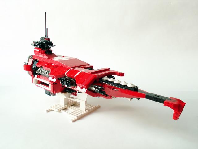 Firstly, the shape. This mix of a bulky sculpted look and a skinny grim look, with the main body and the nose being their respected points of assesment. Yet despite the contrasting styles throughout the design, it all flows and has a very coherent look. It's not a box. As some of my past WIPs had begun to look like, instead this features areas that look quite fragile and pull of a very spacey and futuristic look.
The countless bits of black greebs poking out from all unseeming locations also help with that spacey look. The look that the red [and white] is really just this outer shell of visually pleasing hull, and that underneath there's really a ship of chunky mechanical greebs. This 'shelled' look is a look I always like, it gives the ship a better sense of realism, that it was built from the inside out, and that it looks like it could actually be used as a ship.
I'll leave you now, for I've got a microscale ship to work on - and the inspiration is flowing through the veins. Carpe diem.
Firstly, the shape. This mix of a bulky sculpted look and a skinny grim look, with the main body and the nose being their respected points of assesment. Yet despite the contrasting styles throughout the design, it all flows and has a very coherent look. It's not a box. As some of my past WIPs had begun to look like, instead this features areas that look quite fragile and pull of a very spacey and futuristic look.The countless bits of black greebs poking out from all unseeming locations also help with that spacey look. The look that the red [and white] is really just this outer shell of visually pleasing hull, and that underneath there's really a ship of chunky mechanical greebs. This 'shelled' look is a look I always like, it gives the ship a better sense of realism, that it was built from the inside out, and that it looks like it could actually be used as a ship.
I'll leave you now, for I've got a microscale ship to work on - and the inspiration is flowing through the veins. Carpe diem.
Tuesday, 3 October 2006
Okay here I go..
Firstly I’d like to thank my good friend Brenden for the invitation and cool intro dealy.
Secondly, well I’m 18, just finished school, sitting HSC exams in a month and currently juggling procrastination and study. Oh yeah and thinking what I’m going to do with the rest of my life. And I think I rank pretty high in the no-buildy club ranks at the moment. (I hope to change that soon though)
Anywho enough of my inane self-warbling, I’ve gone and picked out three of my favourite Space Mocs of the past week.
On B-shelf this morning I noticed these totally awesome Daleks and K-9 by Blakes7. If your reading this Blakes7, post some more pics!
Scale down the oversized Dalek-plunger-death-ray and I’d be willing to trade first born sons, vital organs and family members for one of those marvellous Daleks.
Then theres Jerac’s garbage truck/ smuggling ship which is totally cool, its got playabilty galore with all its greebs, hatches and doodads. I particually like the space-junk piled up in the back. Oh yeah and the steering vanes are an awesome touch.
I’m a sucker for Cowboy Bebop, and as a result Legoswami’s Hammerhead Moc has snagged my attention. It may only be a render but I think it would translate nicely into real bricks. There are a few areas that need a bit of work such as the claw, but beyond that minor nitpick the colours look crisp and the shape is sharp with some nice angles going on. Gotta love those propeller housing boosters and the hose-made harness in the cockpit to.
Thanks for reading this and its good to be posting here.
Monday, 2 October 2006
And then there was two.
Just a quick update today: I'd like to welcome Tom Buckland as my new blogging partner. I strive here to be different from the many other blogs out there, and one way I thought was to have different perspectives - besides having the schizophrenias, there was only one way to do this. I've known Tom online for a few years; he was one of the few great builders on Bzp when I built for .Space there, and he's the main reason why I'm at CS now.
What better way to get a different perspective then to have someone from the opposite end of the Earth! Albeit, we both recognize Her Majesty the Queen as head of state, but he's on beaches during winter while I huddle under the warmth of a scarf and a peacoat.
We've also got a good number of hours between us on the Greenwich Mean Time scale. You know what that means? 24 Hour Blogging! I jest.
Welcome Tom, and happy blogging. I'm sure he'll post a quickie introducing himself soon enough.
Friday, 29 September 2006
Sing to me, O great Muses
I've begun reading The Oydssey, having just finished The Iliad for english class. I've always loved greek mythology, but even more so now. The Iliad was just so powerful, each side beating back the other and winning glory. I suppose I was tainted by seeing the horrible movie of Troy, and I wish I hadn't seen it and it hadn't influenced me whilst reading. Diomedes was my favourite mortal, him and his crazy attacking Ares; Pallas Athena (Or Athene as my translation of the Oydssey names her) was my favourite of the gods, I had favoured Phoebus before, but I got angry at him for whisking away every Trojan hero who got on the downside of a fight within a cloud of mist - and for teaming up on Patroclus. O Patroclus, O Achilles; those Greek loved their men.
That was a fun tangent. In my mind I thought of the subject of today's post, which is Classic Space or the Classic Space Revial as it where; Classic Space to Classical, which reminded me of the Iliad. Anyways, without further delay.
A recent post on CS by a Chad Smith featured a Classic Space 2.0 MOC; essentially a Classic Space themed creation 'revamped' with modern pieces and building styles.
 I was never really a fan of Classic Space. I suppose it was a 'had to be there' thing, and being a child of the 90's I'm a far shoot-off. I lived with Explorians and Pirates. That said, the look of this creation takes the classic retro look of CS and puts it into a context that Teen Fans, like myself, can get along with. The SNOTed grey wing base smooths out the studdly look of the CS ships and is probably the main factor in modernizing the design. Before I go into fine details, I should note that the other intriguing thing about this model was that although it was based upon the same idea it's still very much different from Paul Hanson's Neo-Classic Space, seen in the second picture of this post below.
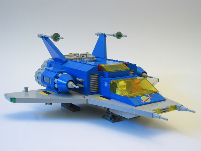 I found the Neo-Classic Space a few months back, and it was the first time I felt the feelings I'd described in the above paragraph. It took an outdated CS design and brought it forward in time. But still, it's very different from Chad Smith's. Chad's featured a less classic looking canopy and cockpit design, though his engines were a toss back to CS. Paul's features still a more retro shape to it, while Chad's feels more like a streamlined bullet train with wings.
As I look at both of them in comparison now, I guess that Paul's is much more of an updated technique only and the shape and feeling still looks retro; Chad's on the other hand comes through on both sides, modernizing technique and style.
Pick and choose to your liking, either way this Classic Space revival look is really catching on with me, and who knows - maybe with some shopping I might pitch in.
Sing to me again, O great Muses, another time.
That was a fun tangent. In my mind I thought of the subject of today's post, which is Classic Space or the Classic Space Revial as it where; Classic Space to Classical, which reminded me of the Iliad. Anyways, without further delay.
A recent post on CS by a Chad Smith featured a Classic Space 2.0 MOC; essentially a Classic Space themed creation 'revamped' with modern pieces and building styles.
I was never really a fan of Classic Space. I suppose it was a 'had to be there' thing, and being a child of the 90's I'm a far shoot-off. I lived with Explorians and Pirates. That said, the look of this creation takes the classic retro look of CS and puts it into a context that Teen Fans, like myself, can get along with. The SNOTed grey wing base smooths out the studdly look of the CS ships and is probably the main factor in modernizing the design. Before I go into fine details, I should note that the other intriguing thing about this model was that although it was based upon the same idea it's still very much different from Paul Hanson's Neo-Classic Space, seen in the second picture of this post below.I found the Neo-Classic Space a few months back, and it was the first time I felt the feelings I'd described in the above paragraph. It took an outdated CS design and brought it forward in time. But still, it's very different from Chad Smith's. Chad's featured a less classic looking canopy and cockpit design, though his engines were a toss back to CS. Paul's features still a more retro shape to it, while Chad's feels more like a streamlined bullet train with wings.As I look at both of them in comparison now, I guess that Paul's is much more of an updated technique only and the shape and feeling still looks retro; Chad's on the other hand comes through on both sides, modernizing technique and style.
Pick and choose to your liking, either way this Classic Space revival look is really catching on with me, and who knows - maybe with some shopping I might pitch in.
Sing to me again, O great Muses, another time.
Friday, 22 September 2006
LGD#4 Under the Sea!
The latest Lego General Disscussion (LGD) contest as come to an end! I seem to have won again, though it was much closer this time around and I think there were others who desevered to win more than I - but don't question the mob. The theme was simply to build an undersea craft or base that could survive the deep depths of the ocean. Unfortunatly most things ended up looking more like spacecraft then submarines, but there was a few select entries that really orchestrated the theme.
 The Coralier Deep Sea Exploration vessel was built by Justin Long, and is a great representation of the theme. To overcome the overall spacey look he simply made it look like a fish. Simple, yet oh so effective. It looks like something that would be the villian's vehicle of choice in a humorous spy movie.
The side greebles are on of my favourite parts, the use of smooth tiles gave it a more robust look; greebs usually look cool but you are left wondering why such equipment would be left to the elements (space, as it was) ? Here it seems that the greebs are build for being outside the craft.
Great build. Looks like a fish, acts like a fish (Chomp-Jaw Action!), so it must be a fish. Came a close second place, my pick for winner.
 In the Sea Bases section we have Sea Station NAMOR. Built by Ean Henninger, Arpy as we know him, NAMOR is "one of several undersea bases designed to gather information about marine life and topography." It's a box on the outside, and judging that that was all to be seen on the entry pic during voting it was probably a cause of Arp's low vote count. Frankly, if they'd seen the inside he'd have kicked ass. Aside from the wicked NAMOR type on the exterior, it's a box. On the interior though he's got everything but the friggin' kitchen sink. Wait, he's got that too. The best part of course is the big red button, no base is complete without a button you should never touch.
Lastly there's mine own entry. The KSS Alexandria was a testing platform for technology that was to be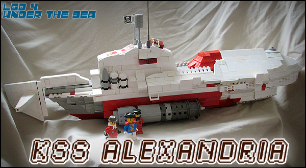 eventually used in space. Built under the new and mysterious banner of the Astra Foederati. Really, it's the biggest thing I've built and 76 studs and it suffers; part supplies ran low, and that created some rough areas. On top of that, I've never really build a minifig scale ship to house more than one person, so it was building in an entirely new field. I do like how it turned out, it looks like a sub and that's all I was really going for. She won me my second LGD, though less deserved than the first it won by people's choice. Perhaps it marks a new page in my building, maybe we'll see more and more larger craft from me. Look for more of the Astra Foederati, that's for sure.
The Coralier Deep Sea Exploration vessel was built by Justin Long, and is a great representation of the theme. To overcome the overall spacey look he simply made it look like a fish. Simple, yet oh so effective. It looks like something that would be the villian's vehicle of choice in a humorous spy movie.The side greebles are on of my favourite parts, the use of smooth tiles gave it a more robust look; greebs usually look cool but you are left wondering why such equipment would be left to the elements (space, as it was) ? Here it seems that the greebs are build for being outside the craft.
Great build. Looks like a fish, acts like a fish (Chomp-Jaw Action!), so it must be a fish. Came a close second place, my pick for winner.
In the Sea Bases section we have Sea Station NAMOR. Built by Ean Henninger, Arpy as we know him, NAMOR is "one of several undersea bases designed to gather information about marine life and topography." It's a box on the outside, and judging that that was all to be seen on the entry pic during voting it was probably a cause of Arp's low vote count. Frankly, if they'd seen the inside he'd have kicked ass. Aside from the wicked NAMOR type on the exterior, it's a box. On the interior though he's got everything but the friggin' kitchen sink. Wait, he's got that too. The best part of course is the big red button, no base is complete without a button you should never touch.
Lastly there's mine own entry. The KSS Alexandria was a testing platform for technology that was to be
eventually used in space. Built under the new and mysterious banner of the Astra Foederati. Really, it's the biggest thing I've built and 76 studs and it suffers; part supplies ran low, and that created some rough areas. On top of that, I've never really build a minifig scale ship to house more than one person, so it was building in an entirely new field. I do like how it turned out, it looks like a sub and that's all I was really going for. She won me my second LGD, though less deserved than the first it won by people's choice. Perhaps it marks a new page in my building, maybe we'll see more and more larger craft from me. Look for more of the Astra Foederati, that's for sure.
Tuesday, 19 September 2006
Renovations
Masoko Tanga's blog is once again going under renovations. Now I'll be running on blogger, but still hosted on Masoko Tanga. Much easier than what I was using before, and hopefully much nicer looking. Bare with, we'll be back up and running soon enough.
Subscribe to:
Posts (Atom)