That was a fun tangent. In my mind I thought of the subject of today's post, which is Classic Space or the Classic Space Revial as it where; Classic Space to Classical, which reminded me of the Iliad. Anyways, without further delay.
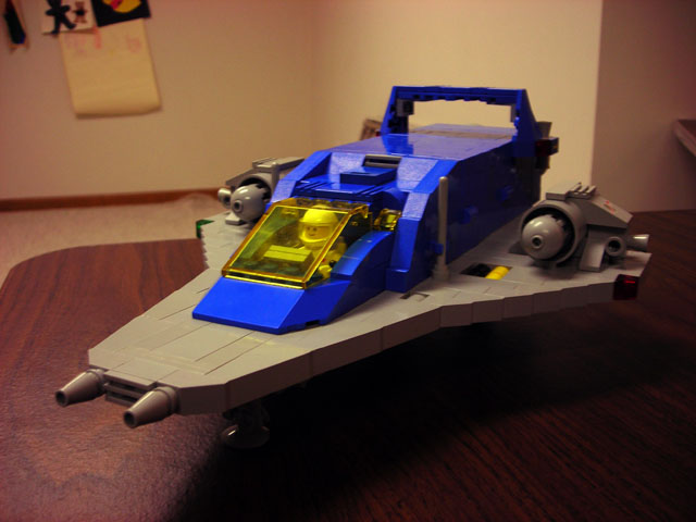
A recent post on CS by a Chad Smith featured a Classic Space 2.0 MOC; essentially a Classic Space themed creation 'revamped' with modern pieces and building styles.
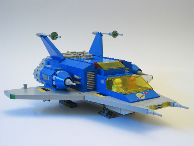
 I was never really a fan of Classic Space. I suppose it was a 'had to be there' thing, and being a child of the 90's I'm a far shoot-off. I lived with Explorians and Pirates. That said, the look of this creation takes the classic retro look of CS and puts it into a context that Teen Fans, like myself, can get along with. The SNOTed grey wing base smooths out the studdly look of the CS ships and is probably the main factor in modernizing the design. Before I go into fine details, I should note that the other intriguing thing about this model was that although it was based upon the same idea it's still very much different from Paul Hanson's Neo-Classic Space, seen in the second picture of this post below.
 I found the Neo-Classic Space a few months back, and it was the first time I felt the feelings I'd described in the above paragraph. It took an outdated CS design and brought it forward in time. But still, it's very different from Chad Smith's. Chad's featured a less classic looking canopy and cockpit design, though his engines were a toss back to CS. Paul's features still a more retro shape to it, while Chad's feels more like a streamlined bullet train with wings.
As I look at both of them in comparison now, I guess that Paul's is much more of an updated technique only and the shape and feeling still looks retro; Chad's on the other hand comes through on both sides, modernizing technique and style.
Pick and choose to your liking, either way this Classic Space revival look is really catching on with me, and who knows - maybe with some shopping I might pitch in.
Sing to me again, O great Muses, another time.
No comments:
Post a Comment