Also in cinema news this week, Terminator 4 and the possibility of the subsequent spin-off Sarah Connor chronicles have been announced. Two camps have developed on this, those who have already started lining up outside the cinemas and the grumpy old farts like me who think the series should have ended after the second. I loved the first two movies; the second one's my favourite film of all time. The third was a fun movie but I don't really consider it part of the Terminator mythos. But hey, I have the power of human choice and my disposal. I'll always have the first two films to worship, I can just plug my fingers into my ears count loudly to myself and ignore subsequent (and blasphemous) instalments. They can butcher the series but the originals will always remain! Who knows, they might even do a good job on this proposed forth instalment.
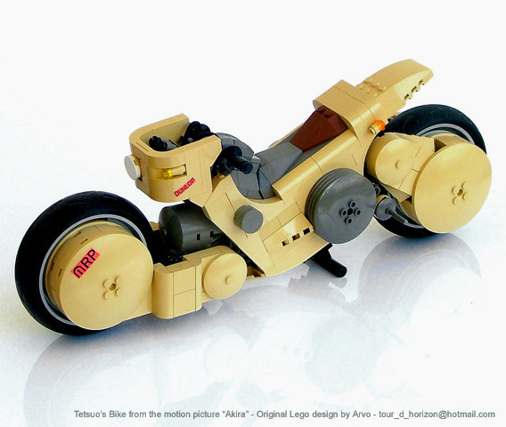
Enough of my ranting, onto the building blocks. Mysterious B-shelf sculpturer Arvo shows us all a thing or two about sculpture with an amazing baby Chestburster model. Just look at that awesome tail, the various tubes running down the sides and into the head are extremely well done and visually effective. And just take a look at those teeth, sharp and deadly, excellent parts placement and usage there. Not forgetting of course, the blood dripping off the side of the platform which is totally gorgeous in every way. H.R. Gieger himself would be proud. Not stopping there, check out his super street bikes which are apparently based from designs from the movie Akira. They come in three flavours, the red streamlined and street-savvy Kaneda design.If that's not your thing, there's the slightly more rugged looking Tetsuo model available in either tan or white, the colour scheme's not the only difference, all-though similar, both have slight physical variations in their designs. I like how the detail includes the throttles on the handle bars and even extending to visible gages and switches on the tan variant. Everything flows so well, there's an absence in rough and blocky edges as these things are so amazingly sexy and streamlined.
Jamie Neufeld brings us the newest addition to the grandiose Vance Quatam's garage, the Quantum Super Thunder Galactic Robo Fighter: Atomictron 7. Very cool, I love the use of the X-pod for the head and that combination Punk/ galactic-crimefighter mohawk atop it looks marvellous. By the looks of it, those white cylinders on the back suggest that this Bot's even packing a jetpack. Gotta love those rugged and tough ribbed boots too.
Jamie Neufeld brings us the newest addition to the grandiose Vance Quatam's garage, the Quantum Super Thunder Galactic Robo Fighter: Atomictron 7. Very cool, I love the use of the X-pod for the head and that combination Punk/ galactic-crimefighter mohawk atop it looks marvellous. By the looks of it, those white cylinders on the back suggest that this Bot's even packing a jetpack. Gotta love those rugged and tough ribbed boots too.
The tiny pitter-patter of multiple feet on metal grating is becoming an all too familiar sound these days with the sudden rise and popularity of multiped spider-mechs in the community. There are quite a few noteable examples out there but Onosendai's one really stands out for me, as opposed to the usual scrawny and delicate design favoured by most Spider-Mech builders, Onesendi has decided to go against the flow. In this current WIP, the metallic arachnid in question is beefy and well armed and yet maintains quite an attractive and slim figure. I really love that turret, great use of Bionicle parts on that. Nifty use of life on mars canopies as leg armour too. Can't wait to see it finished.

Jerac brings us a nifty idea with his good and evil fighters. If I had a choice, I think I'd rather have these guys hovering above my shoulders than a boring old devil & angel combo any day. The sense of scale is great, I like them but I feel that the evil fighter looks more like some kind Mech or weapons platform. But then again, maybe that’s a good thing. Going against the grain and challenging the usual fighter design and all that. It would be interesting to see this idea applied to other styles of Mocs; Mechs, Capital ships etc, etc.. Town fire-stations? Who would dark Firefighters be anyway? An organised gang of tax-funded arsonists? The mind truly does boggle.
On an ending note, here's a quick little Moc from Chuck, The Gi Templar Hardsuit. The gun is a bit oversized, looks like it wouldn't take much for the poor fellow to loose his balence and topple over. I like the mace, it's pretty cute but purely decorative. Is it just me, or am I the only person in the world who was taught at a young age to refer to maces as 'Bommy Knockers'? Weird..
On an ending note, here's a quick little Moc from Chuck, The Gi Templar Hardsuit. The gun is a bit oversized, looks like it wouldn't take much for the poor fellow to loose his balence and topple over. I like the mace, it's pretty cute but purely decorative. Is it just me, or am I the only person in the world who was taught at a young age to refer to maces as 'Bommy Knockers'? Weird..
