Anywho, onto the random Spacey thing of the day. The custom job on this Colonial Viper MK2 model kit is absolutely beautiful, check her out for yourself. You're probably siting there right now and screaming "sacrilege!" and "burn the infadel!" at me at the top of your lungs. But just take one look at it and I dare you not to be impressed. Just look at the incredible attention to detail in the paint work and battle damage, copper wiring has even been used to greeble the thrusters. In somewhat related news, I was on the hunt for BSG wallpapers just yesterday and I came across this little cache of awesome. Have patience, the site seems to go up and down more than a yo-yo. I'll upload the pics to my Flickr if the site has suddenly stopped working. Anywho if it's working, right there at the bottom of the page, huge lovely profile shots of Vipers, a Raptor and the Colonial One. Keep flipping through the pages and you'll find some new-school Cylon Raiders and some beautiful old-school base star blueprints. Not forgetting the awesome wallpapers too, I'm using one right now and it's totally awesome. And you should too!
Anywho, onto the Legoes!*
To get us started a new creation from Felix at last! Gip's Metro Yacht. There's some lovely curves going on and a great interior to match. Next we have Spook's Angelfire tank, it looks really good. There's not much of a description to go along with it but I can easily picture it as an specialized tank for hostile arctic environments. I like the idea of the weathered effect with the grey and bley mixed together. But I don't think it really works in this example in my personal opinion. One idea I'll be stealing for myself is the 2x2 turntable bases used as tiling d
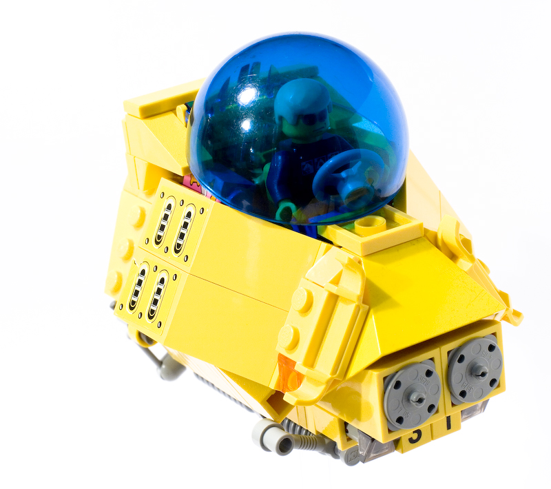
 etail, they look really cool. I like the mud-flaps too. Zopalin brings us his nifty lookin' Space SUV. Its got a nice compact and angular design. Nice bright colours too. Not much of a fan of the detached steering wheel, perhaps some levers on the pilot's sides would work better? And the groceries stuffed into the back is a great bit of detail.
Jerac's Nebulae Gas Miner successfully pulls off that lovely industrial feeling. One look at it and you can tell that its designed for versatility and function over aesthetics. I love the way that the bridge sticks out of its own little notch on the hull like a big greeble. And the thrusters look really good, nice arrangement of wheels there. And bonus points awarded for the lovely crisp and clear photography.
I guess after writing all that I'm even older now, still pretty young compared to a lot of others in the community though. Still old enough to put a cane, driving gloves and suspenders on emergency stand-by in the 'break glass in case of crankiness' box though.
*complaints/ exploding gnomes can be forwarded to tomb136 at gmail dot com
1 comment:
I'm right with you man. Seems like only yesterday we were kids. *sigh*
I was going to make a reference to 9/11 (long story involving cars and ditches) when I realized that both of you, as "foreigners" may not get it as much. Then again, I may be being totally stuck-up-self-absorbed american again. Anywho, carry on.
Post a Comment