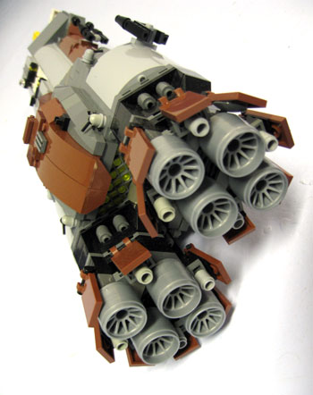
 Interesting uncompleted project from Nnenn here today - we need an acronym for that - a dirty looking microscale ship. It makes some excellent use of BURPs and contains a wonderful looking technic frame. The engines are quite hot as well. And engines are always a fun topic during builds, many people always seem to struggle making a design that's worth while - and although Paul Baulch's article is a great read, someone really needs to expand on it... Maybe I should? Other notable places on Nnenn's ship include the detailed entrance to his hangar, I really do like the sentry/control towers and the control hub on the inside is a nice touch. I'm not too keen on his gun designs, but that's also a hard aspect of building. Maybe I aught to whip up an article on that as well.
 Next on the blog list is a fighter, and a microscale ship - all in one. Usually microscale fighters don't get a whole lot of street cred. if they're built in a larger scale. On the contrary, if one thinks of microscale as a seperate technique of building used for more then just ships that would be implausible in mini-fig scale, then I think the idea of a larger scale fighter in micro is kind of interesting. Anyways, brickshelf user Towel created their fighter after Star Fox's arch enemy's craft - The Wolfen. theirs is specifically based on the one from Star Fox Assault, and although I've never played that game, it seems that the overall design of the Wolfen hasn't altered a whole lot since good ol' Star Fox 64. Towel's approach is built using a variety of techniques - from the pretty complex to the very basic, and where this might look bad on other ships, their use of colour blocking allows them to really pull it off. I think it really goes to show that a great MOC doesn't have to be made entirely of complex techniques - it just has to be executed well. I'm really liking the colourful engine block on this ship too, it reminds you that this ship exists in the realm of video games and not strict-realism. Check it out, it's a really awesome ship design to begin with, and Towel has pulled it off nicely.
 I've got plenty more coming: New member on CS, pezzab, was noticed on brickshelf shortly before his arrival with his BFAI (Brute Force And Ignorance) fighter. Now, although I haven't heard/seen the words from his mouth/posts, I think the ship is supposed to be a sci-fi german fighter, hence the BF part and the colouring. This is an interesting ship, it's really boxy and it works. His use of SNOT makes his fighter look plenty smooth and strong, and seems to allow for some visuals to be worked into the design. And when we turn the fighter over and take a good look at her belly, I think it increases my love of the craft even more. There's something about the landing gear bays - maybe its just the uneven stepping in the doors - that make them look sturdy and robust. Although I think the landing gear itself is lacking. There's a great use of colour in this model, the nice touch of sand green in the missiles is beautiful and the red/white striping around the canopy is great! Pezzab's a pretty new builder, although there are a few other things in his brickshelf; keep an eye on this one!
My last feature here is a bit of a double feature. I've always kept my eye on Brickshelf user Kero40, his wide array of Homeworld themed microscale is interesting and very inspiring. His two latest works are pretty awesome. There's always been something that attracts me to his clunky and messy style of building, whereas some builders would fail miserably when attempting a style along these lines, Kero seems to know almost exactly what he is doing. It seems to be that he builds a basic frame of a ship, and then just begins to throw stuff on - and yet, it works. He has also got a particular skill for using medium sized BURPs to great effect, making smooth uninterrupted panels among the chaos and greebles of the rest of the ship. Some might say however, that his chunky colouring can be quite distracting - a few maybe even hideous. But click around and you'll find other ships that he has built which are very cleanly coloured and show that again - he knows what he is doing.
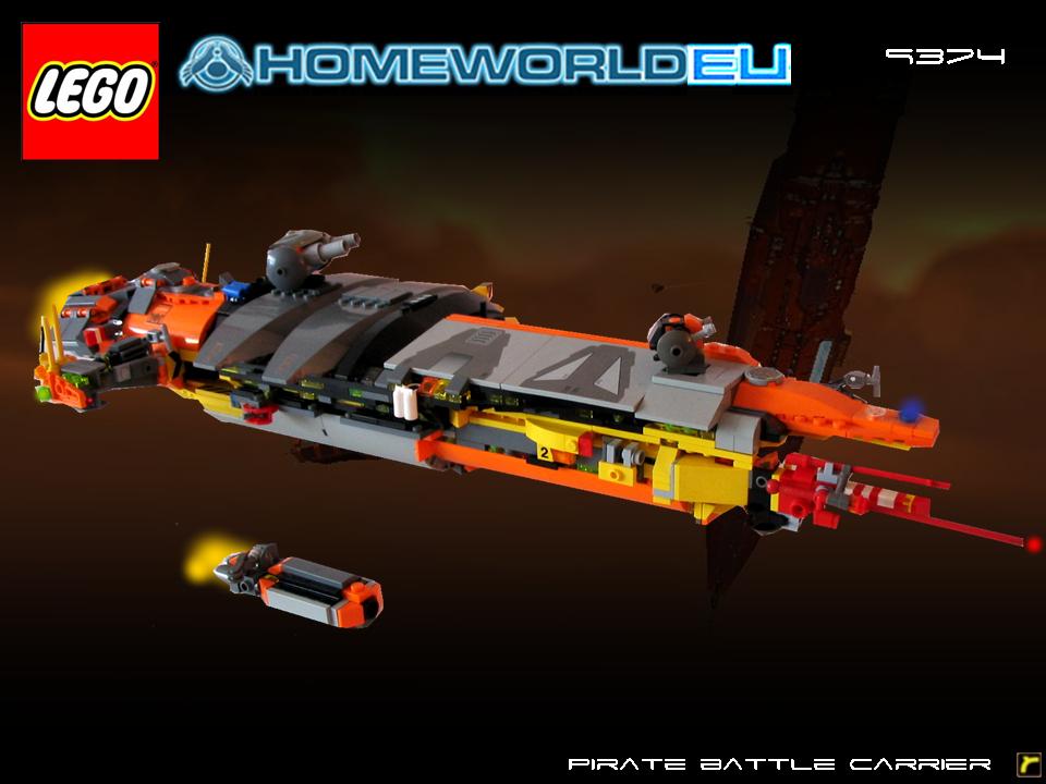 I'll go specifically first with his Pirate battle-carrier. This represents his clunky building style perfectly. Eclectic colours, mixed smooth and greebley sections, and big large turrets that still don't seem to betray scale. This ship really looks like it's just been clobbered together from a bunch of other craft, and outfitted with massive cannons. It's messy, and that's how it's supposed to be. Scattered windows also do great to bring in scale, and the small accompanying craft really adds some realism - I don't quite know how, but I think that I'm going to try and do the same thing in the future. The mass block of engines at the back work, though I wish they were more then wheels.
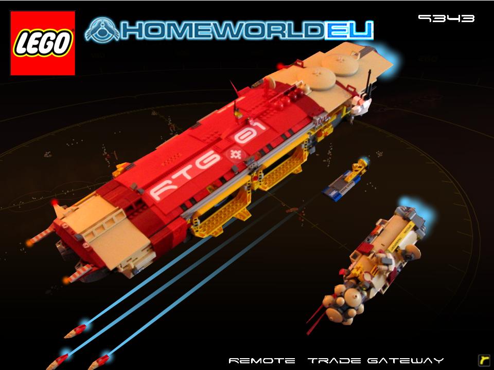 Next is his Sobani Remote Trade Gateway Spaceship. This is quite the juxtaposition to the above work, it isn't really messy, the colours are cleaner, and there's no turrets of varying sizes. Instead this ship seems to be very well planned and structured, which being that the last ship was for pirates, seems fitting. The two large yellow hangars are great, and I wish I had whatever piece he's using for them. The smooth hull is dotted and creased with inlays of detail, striking the imagination - one particular trench along the middle near the front with the barring (what piece is that?) is quite intriguing. Engines are, again, a bit disappointing - however they do work with the design. And again the use of smaller support craft bring an odd sense of realism to the model.
Alright, I've written myself to death. Fitting no?
2 comments:
Farewell old Girl, she had a good run. The old war-horse sent out to pasture..
July 9th 2004 to April 9th 2007
It seems you take inspiration, for these two last ships, from a book I have in my bookshelf.
They are wonderful.
Post a Comment