School is over. Those last couple weeks were a pain in the arse, but it's done. So what does this mean? Well, hopefully it means I'll be back on the building circuit - I thought I might go the way of Tom there for a while (jokes). Of course, I give Tom a pat on the back for that interview, maybe I'll top it one day. Getting out of school also means I'll have time to renovate Masoko Tanga, again! I've been wanting to try and separate the Art from the Lego, because I think the Art deserves a larger and more devoted section. So I'm going to work on some flash galleries very akin to those on my sister's new site: Unicorn Break, easier browsing and I'll still leave links to brickshelf for those larger images. In the end I think it'll be much more streamlined and organized (as far as the coding/design goes!), really the idea is to make the site more of a gallery layout as opposed to the news like layout it has now. The design involves this lovely piece of Space Art I did: [link].
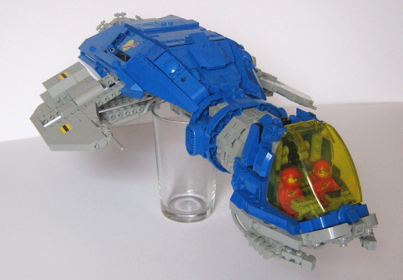
 Onto today's features. We'll start with a quick glance at some Neo-Classic Space by Peter Reid (legoloverman). It definitely leaves behind most CS conventions, yet still conveys the theme - it's that instantly recognizable colour scheme, pulled off with much excellence here by Peter. The modernization continued even to the figs, which feature newer faces and the modern style helmet. One thing I must add, there's no elegance to this model, I might go far enough to suggest the concept is actually quite ugly - one betrayal of the original theme, while boxy and rigid it still carried a sense of elegance that this misses.
 Peter Morris built some mircoscale, one of which near rivals Baulch in shear size: The Asteroid Processor/Harvester. So wow. That's pretty damn big. Peter's messy building style comes in handy with this one, giving a true slapped together industrial spacecraft look. Adding to it's grace is a series of pictures that show the ship processing an asteroid, this ship was built with it's intended purpose in mind and that wins some bonus points. Numerous secondary details, like the pumps and hoses that enable the ship to link up with Peter's Bulk Transport really help in giving the ship a blanket of support. It's not enough to be believable on your own, providing a working backdrop really heightens the realism.
 Lastly we have a microscale sci-fi city design by brickshelf user Sly420. It makes use of the abstract shapes of many well known pieces to achieve a believable city scape. Yes, that is a rocket tail - but what if I use it like this? Using pieces to this effect always generates praise, perhaps this isn't the most ground breaking example but it fits the general theme. There's not too much to say about this one, but take a good look at it and make use of the various techniques they employ throughout it's construction.
 Onto today's features. We'll start with a quick glance at some Neo-Classic Space by Peter Reid (legoloverman). It definitely leaves behind most CS conventions, yet still conveys the theme - it's that instantly recognizable colour scheme, pulled off with much excellence here by Peter. The modernization continued even to the figs, which feature newer faces and the modern style helmet. One thing I must add, there's no elegance to this model, I might go far enough to suggest the concept is actually quite ugly - one betrayal of the original theme, while boxy and rigid it still carried a sense of elegance that this misses.
 Peter Morris built some mircoscale, one of which near rivals Baulch in shear size: The Asteroid Processor/Harvester. So wow. That's pretty damn big. Peter's messy building style comes in handy with this one, giving a true slapped together industrial spacecraft look. Adding to it's grace is a series of pictures that show the ship processing an asteroid, this ship was built with it's intended purpose in mind and that wins some bonus points. Numerous secondary details, like the pumps and hoses that enable the ship to link up with Peter's Bulk Transport really help in giving the ship a blanket of support. It's not enough to be believable on your own, providing a working backdrop really heightens the realism.
 Lastly we have a microscale sci-fi city design by brickshelf user Sly420. It makes use of the abstract shapes of many well known pieces to achieve a believable city scape. Yes, that is a rocket tail - but what if I use it like this? Using pieces to this effect always generates praise, perhaps this isn't the most ground breaking example but it fits the general theme. There's not too much to say about this one, but take a good look at it and make use of the various techniques they employ throughout it's construction.
No comments:
Post a Comment